
Calendar creators long ago did a little math and figured out the 12 provinces and territories in Canada roughly aligned with the number of months in the year (until another territory was added in more recent times). They determined that if they found a nice photo from each area, they would have a marketable calendar to sell across the county.
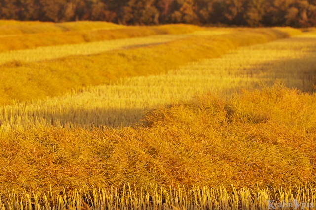
Freshly swathed grain fields are beautiful but I still wouldn’t pick them for the Saskatchewan spot in the calendar.
Years ago, the token Saskatchewan shots would typically be scenes with elevators in the midst of grain fields or, if they mixed it up a little, images of just grain fields. They can be nice but it’s all a little predictable.
Granted if you only have one opportunity to depict a huge province it would be tempting to fall back on the tried and cliched. Why run the risk of dampening calendar sales by confusing people with the truth of what the rest of the province looks like? Just because there are 100,000 lakes here doesn’t give calendar makers the freedom to include one of them.
Thankfully the calendars in recent years have discovered a few more ways to portray our province though somehow it often seems like a huge missed opportunity. Given this record, I find it astounding that no calendar people ever called me up for advice. I am, however, undeterred! I have decided to post my unsolicited opinion here and let the pieces fall where they may.
Now I could recommend a gorgeous lake shot but why miss an opportunity to show off a predator? If it was up to me, I would pick a hawk on a fence. It’s beautiful, iconic and familiar scene if you’re travelling down a country road as the sun is setting. Where else would you want to be?
As it happens, I have two potential candidates for this imaginary calendar. I would be honoured if you would help me choose which hawk shot best depicts Saskatchewan. Feel free to completely ignore the fact that most readers of this blog live outside Saskatchewan, or even Canada for that matter. Oh heck, even if you couldn’t find Saskatchewan on Google Maps, it’s really an honourary thing anyway.
The important thing is which hawk photo would you pick?
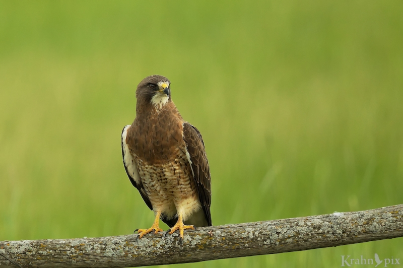
This hawk comes facing right with a cleaner look sitting on a classic old fence rail that still shows the bend the tree once had.
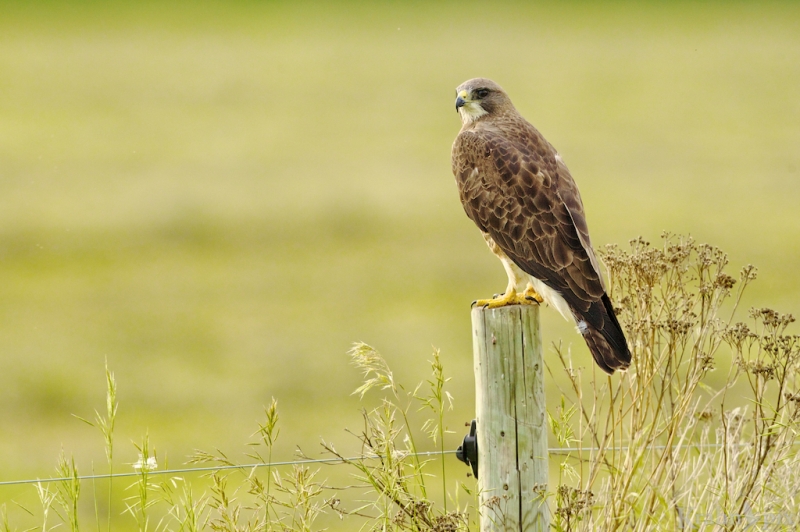
This hawk faces left on a classic fence post stance with some vegetation growing up beside it. I had wanted to go further to my left but I noticed the electric fence and decided to keep my distance.


The colour in that grain field is wicked Lyle – I prefer the first shot of the Hawk as it is contrasted against the background better, the fence just adds to it all – quality as always
LikeLike
The light was pretty amazing on the grain. Always interested to hear your opinions on photo choices. Glad you liked them.
LikeLike
I like the first – more menacing. I don’t know if that has a thing to do with Saskatchewan, but I like the shot best.
LikeLike
Menacing might be an even better criteria. Hopefully it doesn’t have much to do with SK other than the football team which just won the national championship. They already have a mascot – a gopher. Maybe a menacing upgrade is in order.
LikeLike
I am voting for #2. I like how there is distance out ahead of him if he turns back around to the front. I think on the calendar that will have a nice effect. He is looking back at something he sees.
Then again, the actual image of the hawk on the first photo is more detailed. It is a stunning image.
I vote for the top photo for the cover of the calendar and the 2nd for the Sasckatchewan (sic) page. BOOM! Solved that one.
LikeLike
Creatively solved and complimented! Thanks so much for playing along. I was so pleased to find both of these hawks just a few minutes apart.
LikeLike
I’ll stop to say a quick hello rather than just add my face to the “like” line up. I’m darting through the posts I’ve missed, but I keep a hawk eye out for Krahn pix. The color of that field is glorious!
LikeLike
Always happy to hear a quick hello from you. The hawks seem to never stray too far from Krahnpix!
LikeLike
Personally, I would not hesitate and go for the second hawk shot: to me, the bit of vegetation in the bottom part of the frame and the pleasing lighting totally make the shot.
LikeLike
I appreciate your thots. I was surprised how much I liked having that vegetation in the shot after I looked at it for a bit.
LikeLike
Wow. Gorgeous shots. Although I like the first photo better because of the detail, it could have been taken anywhere. The second one seems to have more of a Saskatchewan feel (or at least some sense of place created by the fence and flora), so I think I’d have to go with that for the calendar image.
LikeLike
Thanks so much for playing along and your kind comments. It’s fascinating what we associate with a certain place and what details make it seem to fit in a location. Taking that further, I have sometimes observed a scene in nature and knew that it would seem unnatural because the colours were different than what we normally expect to see.
LikeLike
It’s a toughie as I prefer the over the should glance but not the wire in the second. The first look is nice enough that it gets my vote with the more natural looking perch even if it is a fence rail.
LikeLike
I’m glad it seemed tough. Great observations on the photos. I found it interesting that you liked the over the shoulder look better. I appreciate you taking the time to check it out and comment.
LikeLike
The second hawk photo gets my vote.
LikeLike
Thanks for voting!
LikeLike
I vote for the first one. I like the detail of the breast feathers and also the classic fence post. The second picture does give a bit more modern look. I think it would depend on the overall theme of the calendar. If it was a nature calendar I would go for the first one. If it was a calendar that featured modern shots, like maybe a city shot of Toronto for Ontario, then I would go for the second one.
My Canadian ancestry is from New Brunswick and Nova Scotia in the 1700’s, so I like the older classic pictures of Canada.
LikeLike
Thanks for sharing your thots. Your calendar would be well themed and your reasoning makes great sense.
It’s interesting that you can trace your Canadian ancestry that far back! I’m impressed.
LikeLike
I like both images but my first choice would be your first image; to me it presents a more powerful, impressive presentation of the hawk.
~Lindy
LikeLike
When I think of hawks, it’s the powerful image that comes to mind so focusing on that part of the presentation is natural. Thanks for the comments.
LikeLike
I like the second. The profile of the hawk is beautiful and the dark feathers agains the light green is striking. I love the dried grass too–gives a crisp organic layer to the Monet effect of the background.
LikeLike
They really do create a striking profile! When I looked at the scene, after the hawk it was the dried grass and weeds that caught my eye as you described so well. I appreciate your knowledgeable observations.
LikeLike
The second one is my pick – strength and power against the fragile grasses.
LikeLike
That’s a great way to look at it. I like the contrast you painted.
LikeLike
As a photo, I prefer the second image–I like your composition, the pose of the hawk, the generous “white space” to the left, and the electrified fence, so if this were merely a photo competition, I’d surely vote for it. However, since this is a calendar about which we are speaking (at least a virtual one) and we are trying to represent your province, we have to think of the potential messaging of the photo. Do you want to emphasize wide open spaces, the wildness, the unfettered freedom of your home province? If so, the first photo might be a better choice. Fences always send mixed messages. Are you trying to keep people out? The electrified fence and the sentinel hawk look almost like a border post, intended to control access. Are you trying to follow the adage from a Robert Frost poem that “good fences make good neighbors?” Maybe, though, the calendar maker wants to capture scenes typical of your province and is not concerned about messaging. In that case, I’d be back to the second photo, for I remember you telling me once how those strands of wire are verymuch a part of your “normal” life.
LikeLike
Yes, barbed wire is a common sight as soon as I get out of the city. I suppose because it’s so common I never thot of it as keeping people out since its purpose is to keep cattle in. Over the years I’ve also gone over and under those fences at friends’ farms and mostly missed the barbs though I’ve stayed away from the electrical ones. The hawks are often on fence posts and bales to give them a little height advantage in hunting. Interesting though I don’t think I’ve ever seen one catch anything.
Your thots about messaging lead you to all the right questions for this virtual calendar. I can’t help but think that you might put more sound reasoning to it than most calendar creators.
LikeLike
I prefer the first one if I just focus on the bird, but I think the second is best for your imaginary calendar. It shows some plants, and the fence is more clearly a fence, implying humans. The hawk looking backwards from the fence at the hypothetical human viewer can represent the coexistence of man and nature, or some such.
I’m American but I went to the Canada Games once…
LikeLike
Your reasoning on photo choice makes perfect sense to me. The connection between the viewer and the hawk is an interesting means to draw out the human/nature connection. I didn’t think of that.
Your Canadian connection makes you eminently qualified!!!
LikeLike
I like the second one Lyle,. the electric fence gives the picture some further mystery!
LikeLike
Thanks. Mystery is good in photos and I think I like it more than most. Mostly I’m just happy I didn’t bump into it without paying attention!
LikeLike
I like the first shot as the wonderful blurred background and the overall simplicity of the composition brings your attention to the Hawk and the Hawk comes off as proud, attentive,strong with it’s talons clearly visible.
LikeLike
I appreciate those thotful comments to back up your opinion. I like how you described the photo from the perspective of the hawk.
LikeLike
I too get tired of the token Sk shots when there are waterfalls and cliffs and valleys and interesting people and amazing wildlife. I AM amazed that the calendar-makers haven’t asked your opinion yet! 🙂 I love the richness of the first pic but love the perspective of the second – can I call it a tie? Maybe Sk could get TWO months instead of Ontario hogging them all? hehe
LikeLike
In a virtual calendar you can do whatever you want! Thanks for the comments. I had a much better year getting hawks – still have a few shots in reserve.
LikeLike
Whoa. Tough choice. My eye went to the second one instantly and that would have been my choice but upon closer examination I do think the electric fence wire detracts somewhat from the ‘natural’ look of what is otherwise an excellent wildlife photo. But then again if that type of fencing is a common feature in that area’s landscape then I suppose it is a natural fixture. At least the hawk must feel that it is. So still a tough choice but I’m sticking with my first inclination and going with the second shot.
LikeLike
You have to stick with your first instinct! I think I probably went through the same thot process when I saw the electric fence but decided it was OK to have in there – electric fences are common enough. The fence post is also made by people or a natural fixture as you call it. Good terminology.
LikeLike
Extremely hard choice between the two, but I’d have to go with #2. It just has more of the Saskatchewan feel that I remember with the weeds and fenceposts along the roadside. Perhaps the rule of thirds plays into the choice just a wee bit, too, though I never consider that a hard and fast requirement.
LikeLike
Who knew I liked weeds but I like the effect they create here. I agree with you on the ‘principle’ of thirds. Thanks for the comments.
LikeLike
Both of these pictures are great, but I like the first one. It’s hard to get a picture like that which shows the markings on the front, and the facial markings….even the markings on the beak. My vote would have to go to the one showing the front.
LikeLike
Thanks. I was pretty excited to get the opportunity to shoot this one and get close enough to get you described. Then a little further down the road I found the second one. Great evening!
LikeLike
I like the second one. Seriously, have you thought (thot) about creating your own calendar?
LikeLike
I appreciate the vote of confidence.
LikeLike
They’re both beautiful, but I think I’d go with picture one. I like the green background and that the hawk is facing the camera.
LikeLike
Thanks. That background worked out exactly like I’d hoped! I appreciate that you gave reasons for your choice – I always find that interesting.
LikeLike
Definitely the second shot. If it is for a Canadian calendar the second image has the prairie feel to it without the cliché directly attached. The wild and free feel of Sask… Elevator free. Nice job.
LikeLike
Thanks. That’s a wonderful way of describing exactly what I was feeling when it was just me and the hawk out there and the sun on the way down.
LikeLike
I had a hard time picking a favorite. I love them both. But if I have to choose… the first one.
LikeLike
Glad you liked them. I appreciate you letting me know your favourite. They are both getting votes so I’ll have to go back and count them up at the end.
LikeLike
I love them both but I have to go with the second. I think the fence post and bushes add to the overall effect.
LikeLike
Thanks. That was my conclusion after looking at them as well.
LikeLike
I like the one on the branch because you can see the throat feathering.
LikeLike
Thanks for letting me know. It’s always interesting to hear what people like and what they base their decisions on since there are so many perspectives.
LikeLike
My vote goes for 1st.
Love that yellow grain!
LikeLike
When the evening sun hit that grain, it almost felt like it came alive. Thanks for your comments.
LikeLike
Both are beautiful but I’d go for #1
LikeLike
Thanks for checking them out and letting me know.
LikeLike
Neither!
A really good calendar would show the hawk on a bale from your Fall Collection post. Or even the sandhill cranes from that same post.
LikeLike
I am impressed that you can remember photos from 10 posts ago!
LikeLike
But if I have to choose from the two photos in this post, I choose the second. Somehow there is more life about it. The hawk is looking round, the crops and weeds are growing, even the fence is buzzing.
LikeLike
Those are great observations not picked up by anyone else and I like the idea of the fence buzzing!
LikeLike
It is a really tough choice as both are great, but I think the second is my fav. enough extra to add to pix but not enough to deter from hawk.
LikeLike
Thanks. I came to the same conclusion. It’s hard to find that right balance sometimes.
LikeLike
I’d go for the first one – the greens and browns and yellows are gorgeous.
LikeLike
Thanks. The light and colours were out in good supply that evening.
LikeLike
The 2nd one is my pick. To me it describes a romantic Saskatchewan the plains, grasses, big beautiful skies, open prairie and the long goodbye…
LikeLike
I like that description. The beauty here is sometimes not of the overwhelming variety but a peaceful kind that grows on you with time and age.
LikeLike
Both good pics, but I think I like the second one a bit better because the bush adds a little extra interest to the photo. And my wife is from Saskatchewan 🙂
LikeLike
I share your opinion on the photo and the place where my wife is from! Thanks for the comment. By the way, those things your wife says on your blog are funny and she definitely must have a sense of humour unless she hasn’t found them yet.
LikeLike
Haha, yes she does have a good sense of humour. She fully endorsed me starting that blog. Go Riders!
LikeLike